Supermarket Shelves: The Life Aesthetics and Consumption Codes Hidden Behind Products


I. Shelf Display: Not "Random Placement", but "Precise Design"
The first time I noticed the knowledge behind shelf display was last year when I helped a friend look for a niche brand of yogurt in the supermarket. I walked back and forth three times in the dairy section before finally finding it in the corner of the bottom shelf—while the middle layer at eye level was filled with the top three best-selling mainstream brands.
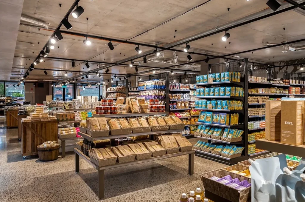
Later, I learned from a supermarket guide that this is the classic “Golden Shelf Position Rule” in the retail industry: the area 1.2 to 1.5 meters from the ground is the “golden zone” that consumers can easily see and reach, usually reserved for core products with high sales and profits; the upper heavy duty shelving mostly holds products with large packaging or high brand recognition, such as family-sized detergent and grain and oil products; the lower shelves are for niche brands, promotional items, or “hidden gems” that require bending down to find.
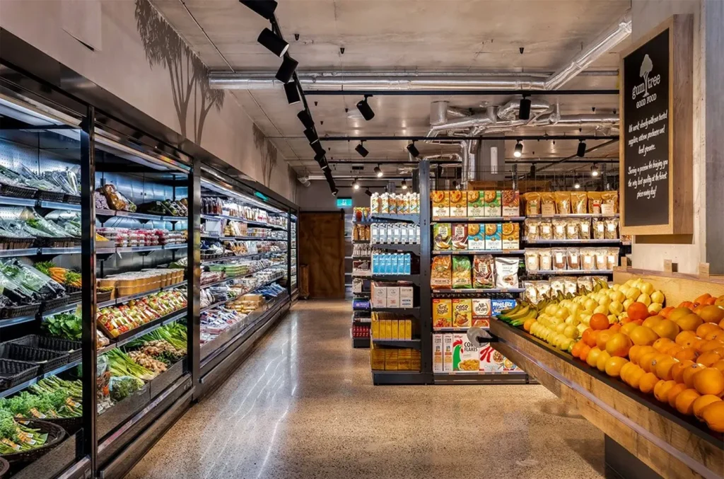
In addition to the “height order,” the “left-right logic” of shelves is also interesting. Most people are used to walking from left to right in supermarkets, so the “starting position” on the left side of the shelf is used to place seasonal new products or promotional items—such as iced drinks in summer and mooncake gift boxes before the Mid-Autumn Festival—attracting attention with eye-catching price tags and colors. The “end position” on the right side, on the other hand, is often used to place related products. For example, ketchup is placed next to the potato chip shelf, and butter is placed near the bread section, subtly guiding consumers to “grab one more item on the way.”
An even more detailed aspect is the “arrangement density” of products. In the snack and daily necessities sections, product shelves are usually packed full to create a sense of security from “abundance and sufficiency”; while in the organic vegetable and imported food sections, shelves are deliberately left with gaps, matched with wooden pallets and green plant decorations, using “negative space” to highlight the high-end and delicacy of the products. This combination of “density and sparseness” may seem random but actually fits the consumption scenarios of different product categories precisely.
II. The "Consumer Psychology Game" on Shelves: What You See Is What They Want You to See
Have you ever had this experience while shopping in a supermarket: you only planned to buy a bottle of milk, but when you walked to the shelf, you were attracted by the “buy two get one free” yogurt next to it, and finally walked out with a pile of snacks? In fact, this hides the “psychological traps” in shelf design—every detail is quietly influencing your consumption decisions.
The most common one is the “price anchor” strategy. On snack shelves, you will often see such an arrangement: mid-priced products (e.g., a popular brand of potato chips priced at 15 yuan) are placed in the middle, while ordinary chips at 8 yuan and imported ones at 25 yuan are placed on either side. At this time, the 15-yuan popular chips will seem “more cost-effective”—the 8-yuan ones make it not look cheap, and the 25-yuan ones make it not look expensive. Unconsciously, you will tend to choose the mid-priced product. This way of highlighting the value of target products through comparison is particularly common in the grain, oil, and daily chemical sections.
There is also the “color guidance” technique. In the fresh produce section, red apples, orange oranges, and green vegetables are deliberately arranged in a color gradient. The bright colors can stimulate appetite, making you can’t help but take a few more; while in the baby products section, shelves mostly use soft light blue, light pink, and off-white colors, matched with rounded display props, creating a “safe and warm” atmosphere that makes parents more willing to stay. Even the lighting on the shelves is well-thought-out: reddish light is used in the fresh meat section to make the meat look more tender, and warm yellow light is used in the bread section to highlight the soft texture—these visual details are all quietly influencing your desire to buy.
The most “unavoidable” one is the “children’s trap.” On the snack and toy shelves of supermarkets, you will find that the area below 1.2 meters (at children’s eye level) is filled with snacks in cartoon packaging and small-sized toys, and even animated stickers are pasted on the bottom of the shelves. When parents take their children to the supermarket, kids are easily attracted by these “exclusive products” and cry to buy them, and parents often give in—this is the precise positioning for “family consumption” in shelf design.
III. The Vitality of Life in Shelves: Hiding the Warmth of a City's Daily Life
If the display logic of shelves is “business wisdom,” then the products themselves on the shelves are a “microcosm” of a city’s life. Every time I travel to a different city, I always like to visit the local supermarkets, feeling the warmth of the city’s daily life through the products on the shelves.
In southern China supermarkets, the fresh produce shelves are filled with fresh bamboo fungus, water chestnuts, and Houttuynia cordata, and the refrigerated section is full of various flavors of herbal tea and turtle jelly. You can even find freshly made rice rolls and roasted meat—these products hide the living habits of southerners, who “pay attention to fresh ingredients and prefer to clear heat and remove dampness”; while in northern China supermarkets, the grain and oil section has large bags of flour and rice piled up like small hills, the frozen section is full of dumplings, steamed buns, and frozen pears, and in winter, boxes of Chinese cabbage and radishes are piled at the entrance—this is the life mark of northerners, who “stock up for winter and love eating pasta.”
Even the “temporary shelves” in supermarkets hide traces of seasons and festivals. In spring, the entrance shelves are filled with green rice cakes and cherry blossom-flavored snacks; in summer, an “iced drink section” is added next to the refrigerated cabinets; in autumn, mooncake and hairy crab gift boxes occupy the most prominent positions; in winter, hot pot base and lamb rolls are placed in the C position of the shelves. These “temporary shelves” that change with the seasons are like the “seasonal alarm clocks” of supermarkets, reminding us of the passage of time and adding a sense of ritual to ordinary days.
Conclusion
Next time you go to the supermarket, slow down and take a closer look at those supermarket shelves: see how the products in the golden zone attract your attention, how the color matching affects your mood, and how the products on the shelves tell the story of life. These seemingly ordinary product shelves are not only the “habitat” of products but also the “connection point” between business and life—they hide the care of merchants and also hold our love for life. After all, every choice made in front of the shelf is an expectation for a “better life.”
👉 Get in touch with us today to start your project.
🌐 Website: www.onidisplay.com | www.onishopfitting.com